

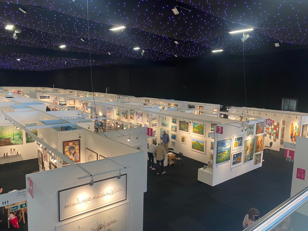
It was with some trepidation that I embarked on a journey to London for the Battersea Affordable Art Fair 8th July 2021. It seemed appropriate that one of the first visits post Covid-19 would be here, as it was probably the last adventure before the first lockdown in March 2020. Last time I went with a blogpost in mind, but this time it was to regain my mojo, to re-ignite the spark to continue with my projects. For this reason I did not take such a minute account of what I saw, I just wanted to get a feel for the event. It did not disappoint in this overarching requirement. There were aspects that I appreciated such as a much improved standard of presentation by all the galleries. March last year was cluttered and messy with bags, bubblewrap, coffee cups and suchlike spilling everywhere and generally untidy, but this year was much more streamlined, less rubbish on view. A great improvement.
The quality of the work seemed generally higher to me, however prices appeared generally lower. This is an interesting observation and I wished I had taken a better indication by recording prices and comparing them with last year as I only have my instinct to suggest this and cannot corroborate with statistics. I wonder if the AAF would agree with me. There certainly were a considerable amount of beautifully wrapped works walking out of the door! How this sits with the galleries and artists is interesting, exactly whose margin is being squeezed? Some reports say the coronavirus impact has reduced disposable income for those who had little spare to begin with, but other reports say weeks of doing very little and not spending much on entertainment has provided an unexpected higher savings pot. Artists struggle as a rule and the epidemic has had major impact with lower sales contrasted by higher productivity. Many people have found solace in returning to artistic endeavour, or discovered it for the first time, but only the market in the future will show if supply and demand are matching up. The market is as fluid and unpredictable as ever.
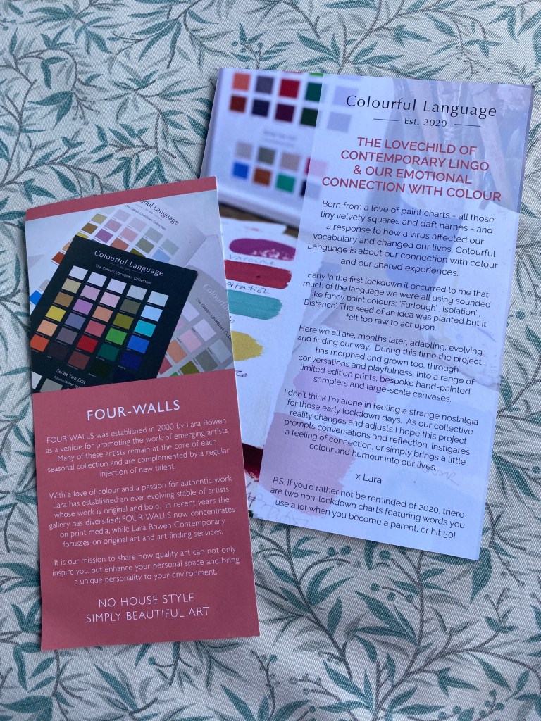
I enjoyed the fun, tongue-in-cheek work of Lara Bowen Colourful Language. Finding inspiration from the coronavirus epidemic and turning it into a smile and a thoroughly apposite work that captures the moment perfectly. Surprised by hitting the zeitgeist the piece is a delightful colour chart for the season, choosing colours and matching them to the vocabulary of the moment, brought a witty and beautiful translation of a communal experience for a pandemic plagued public “Furlough” my particular favourite, as a sludgy sort of green and a strong burnt orange for “Queen’s Gambit” captured the essence of our time.
Many artists also hit the moment with such a lovely Spring in 2020 with everyone appreciating nature during the lockdowns, the National Trust campaign to increase the blossom coverage in Britain and the announcement earlier this year of plans for the Queen’s Canopy to mark the Platinum Jubilee in 2022, there was an abundance of cherry blossom! I dare say they were all aghast to be trumped by Damien Hirst’s Paris exhibition Cherry Blossoms at the Fondation Cartier.
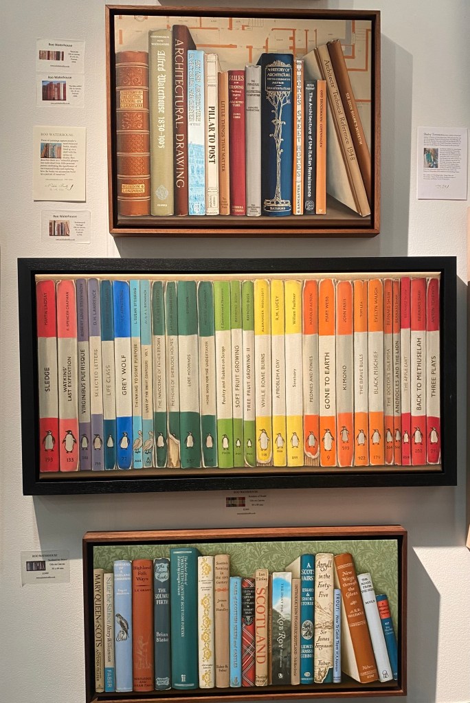
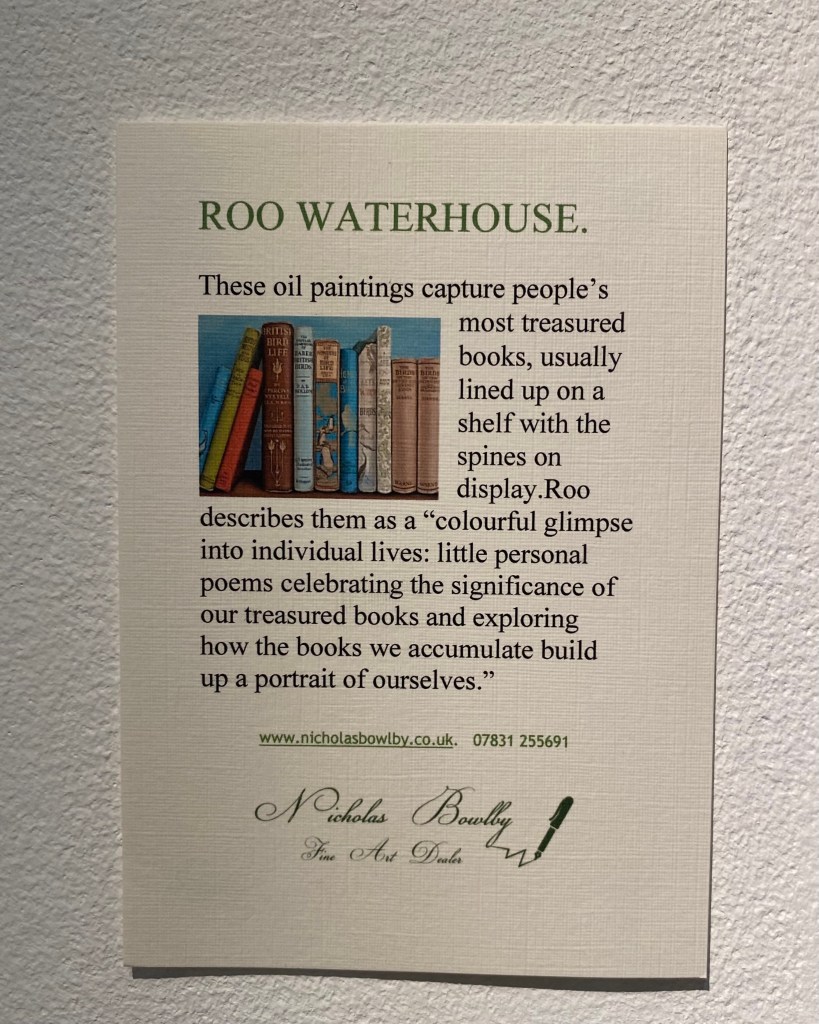
Books and paper featured strongly and I was particularly taken by Roo Waterhouse from Nicholas Bowlby Fine Art Dealer and her Shelf Portraits, realist paintings of books on a shelf that illustrate a person, place, or event and can be personalised to order. Colourful, joyful, and cleverly executed it was like reaching out for a favourite, well-loved read.
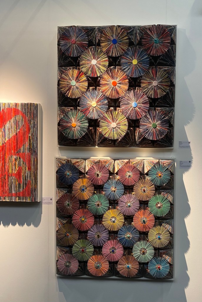
Alberto Fusco exhibiting with TAG Fine Arts uses folded magazines to produce intricate geometric patterns that manifest a sculptural quality that is immensely tactile and invites deep scrutiny. Choosing pages carefully, a blended colour palette is created with what is society’s ephemera. Up-cycling at it’s most inventive.

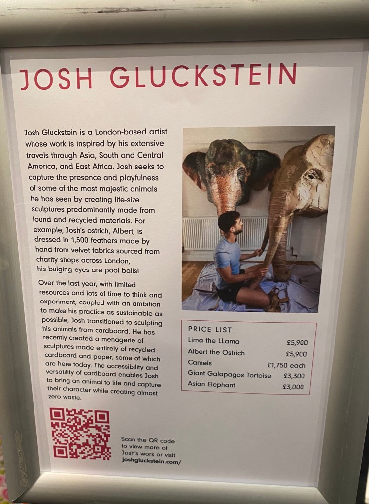
Josh Gluckstein’s giant Albert the Ostrich was another fine specimen, touring above the visitors, sporting feathers made from recycled charity shop velvet and standing imperiously in the middle of the show raised a chuckle and oohs of amazement. It is so wonderful to see imaginative use of stuff we throw away.

The fun element of the AAF continued with this beautiful hare reading the paper. Sunday Papers by Clare Trenchard exhibited by Flying Colours Gallery, made me smile and I wanted to sit on the bench next to him with cup of coffee and the paper myself.

Another hare that took my eye was a delightful bronze statue by Ani Mollereau with Sol Art, entitled Take Me To the Moon the beautiful patina intrigued me, contrasted with the glimpse of the highly polished bronze it evoked an elegance, and sense of wonderment, as the eye followed the gaze of the hare’s head. Musing on what the hare may be thinking I am considering, maybe, with my mojo restored, a return visit to Battersea in October is on the cards…

BATTERSEA, LONDON – AUTUMN
21 – 24 OCTOBER 2021
