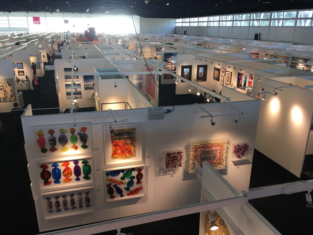
Overview of Affordable Art Fair Battersea
Well this was an interesting experience compared to Frieze and The London Art Fair. Mostly different work, and affordable, if you think a maximum of £6000 comes under that category. Helpfully there were a few items with a green sticker claiming under £500, but they were small, even as small as a framed Ai Weiwei sunflower seed for £30! I was tempted as Ai Weiwei is a particular favourite. The fair was well laid out with room to move, but it was Thursday afternoon. One gallery owner told me it would be really busy come 6 o’clock, or rather he hoped it would be! The Corona virus uncertainty is affecting the behaviour of the public, however later in the pub no 1m personal boundaries that I could see. I was refused a handshake at one point, ok it was just an automatic reaction on my part, but still brought up short. The cafe was good, great cake and interesting sandwiches and Poke Bowls, (whatever they might be, looked tasty though) and I suppose affordable by some other retail standards.
It was the sculpture that really took my eye this time. Jubilee such an elegant bronze from John Huggins at Clifton Fine Art for £3800. I would have loved to have brought this home with me.
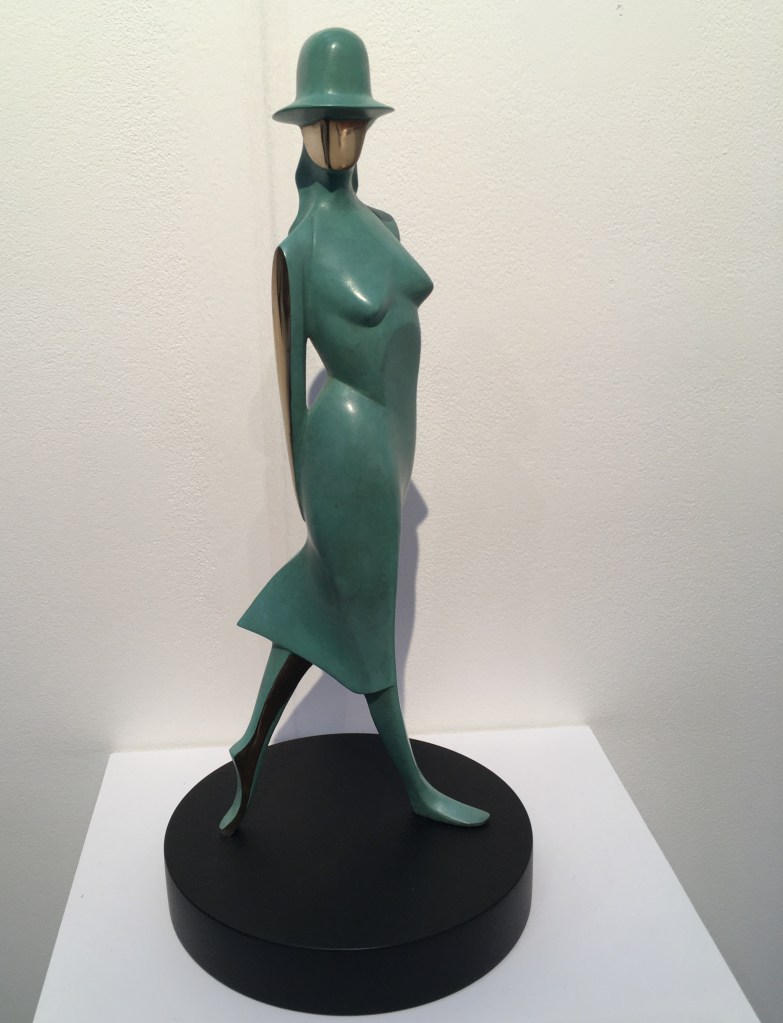
Jubilee
Bronze
John Huggins
Not quite so elegant, but beautifully set as if scuttling up the wall in search of food were the Iron Ants from Julián Cerón, larger than life, but catching the movement and definition of an ant with coiled and spiralled wire. Apologies for the step ladder, I would have liked to have cropped it out, in fact it should not be visible at all. I was amazed at how many gallery spaces were untidy, with little or no attempt to hide bags, coats, art protection carriers, beer bottles and coffee cups! After all presentation is key.
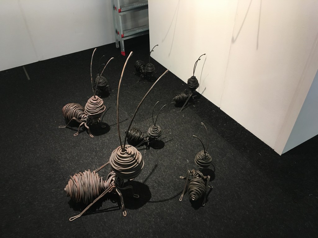
Iron Ants
Julián Cerón
Iron Ants
Julián Cerón
The humour of some of the pieces made me chuckle and this one of a man reading a book that was obviously a heavy read was brilliant, Turning The Page by Emma Jean Kemp shown with Art Salon, beautifully observed with the detail of the body and the carefully noted jeans with folds and stitching perfect. Grabbing the corner of the book he is working against his own weight to prise the page open, pages which shine along the edge, and one could believe his task is possible.
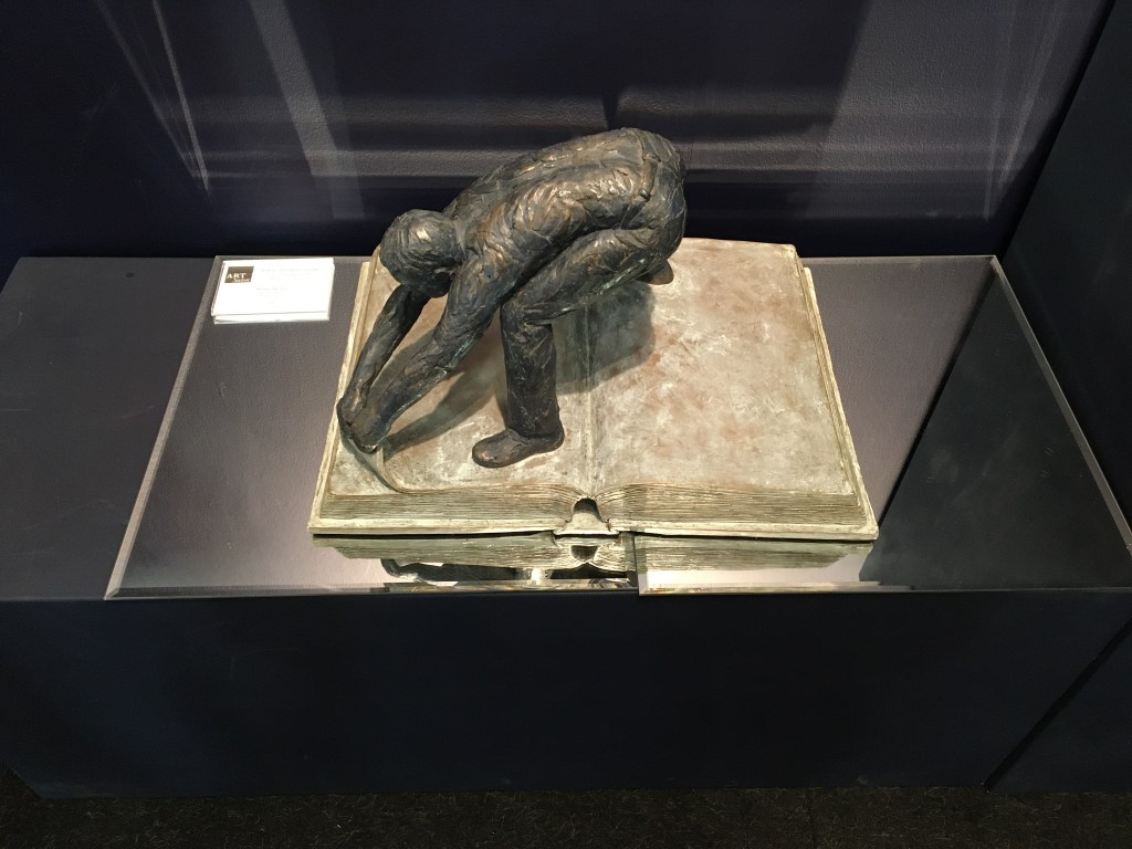
Turning The Page
Bronze Resin
Emma Jean Kemp
Woolff Gallery show a series of witty chairs Please Take A Seat by Joanne Tinker, displayed together in a grid, all fashioned from a cage around a champagne cork, was ingenious and fun, as was the astronaut on a confectionery flying saucer or a shuttlecock by Patrick Boyd.
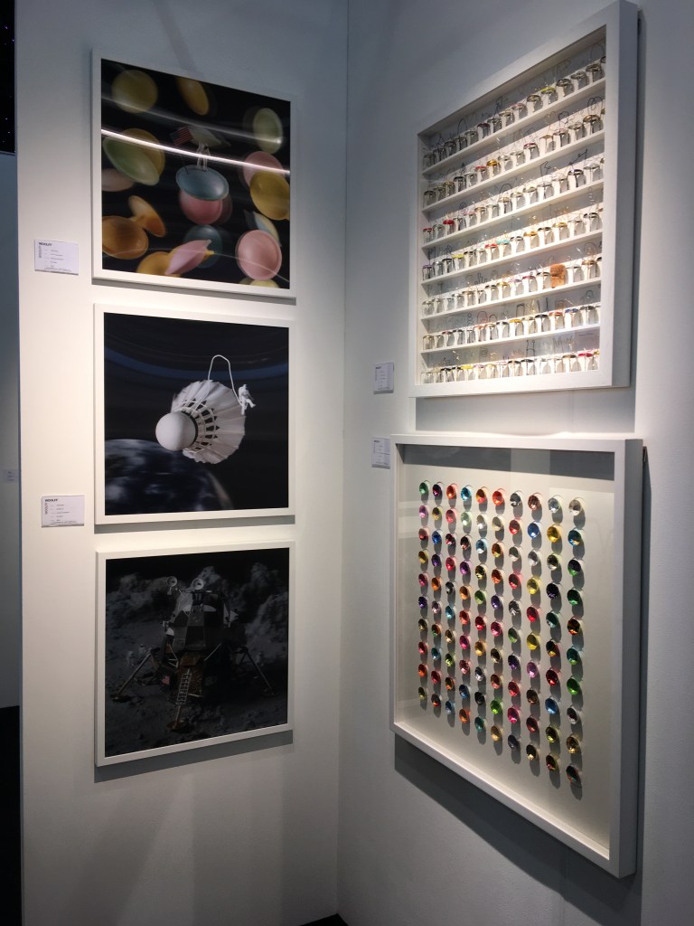
Patrick Boyd & Joanne Tinker 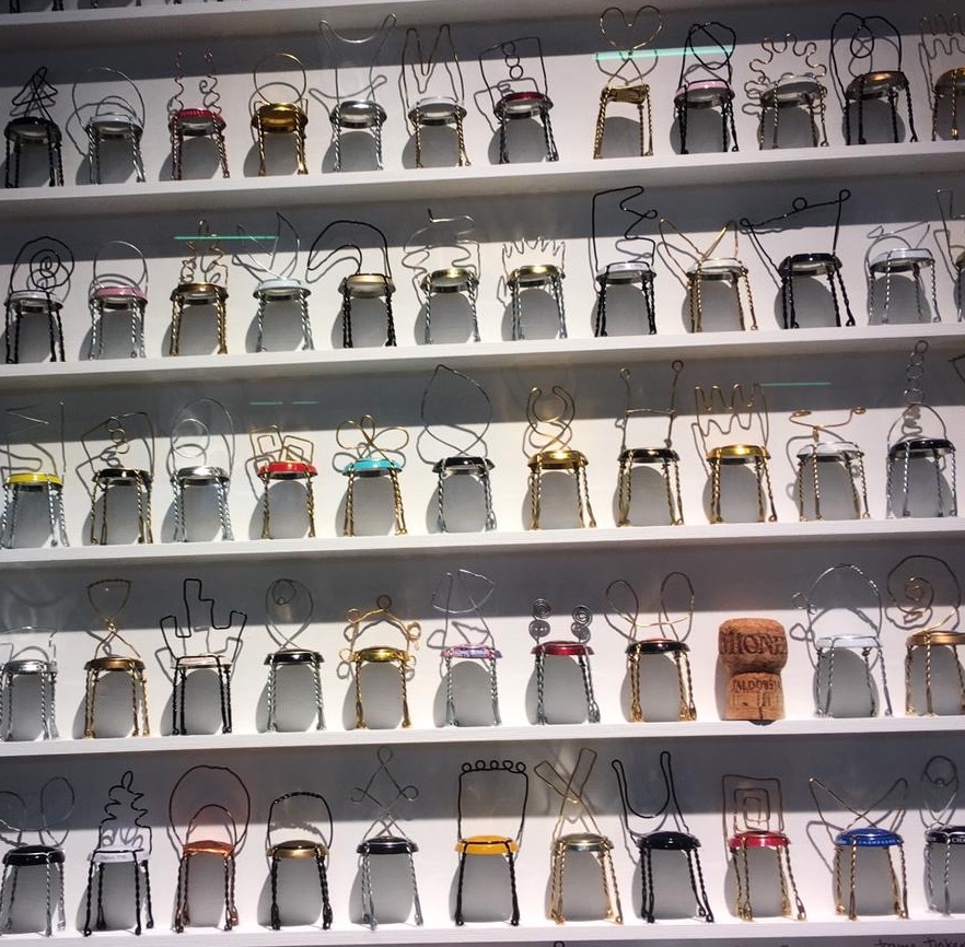
Please Take A Seat 70 x 70cm
Luxury wine cages
Joanne Tinker
The skilful depiction of shadow in paint and the brilliant intricate impasto of the brightly coloured figures on a beach invited a closer look at Flying High by Nuria Miro. The people on the beach flying kites drew the attention to the waves and mirrored the sails in the distance on the sea, whilst on the sand the direction of the shadows to the opposite balanced the composition giving movement to the figures. A delightful painting.
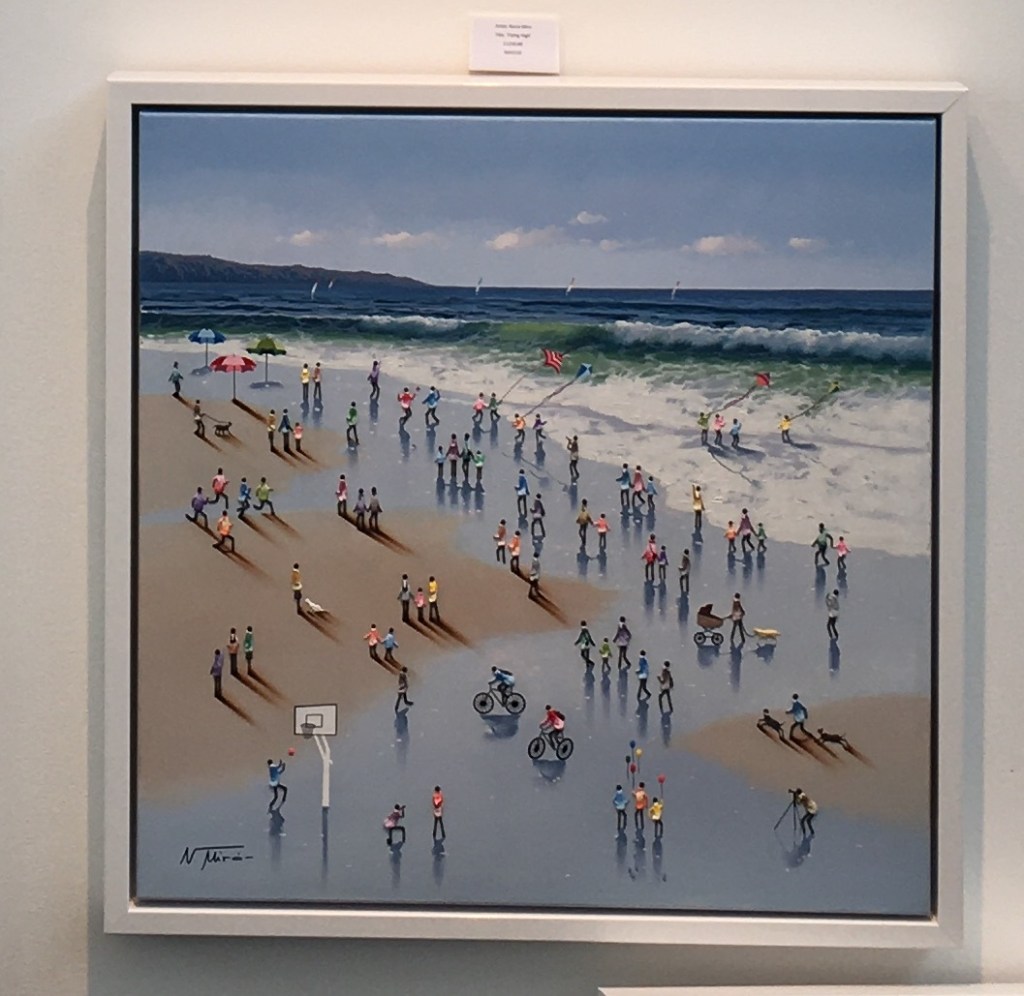
Flying High
Nuria Miro
Paintings that caught my attention were from Matthew J. Frock and Kate Trafeli. Matthew Frock’s work was strangely entrancing, a muted psychedelia he described as vivid colours, but I was challenged with finding a term which described the work for me. Not vivid or bright, but substantial and with depth, sludgy but luminescent, muffled but defined, subdued but lively, the battle of contrasting adjectives to define the work is illusive if mesmerising. Frock says The Grove is an example of starting at the top of the paper and working down using the drips the very loose gouache produces to advantage. Frock explains that he mixes his own paint, using binder and pigment to his own requirements, which gives a very thin medium to work with and copious amounts which lasts a long time, so his work across the spectrum is familiar in tone and quality of paint surface. The Grove reminds me of spiral lollipops, or a supernatural wood, the mind finds faces and eerie contorted shapes in a seemingly cheerful landscape. The vortices and holes in some of the work draw you into a weird other world of strange colours.
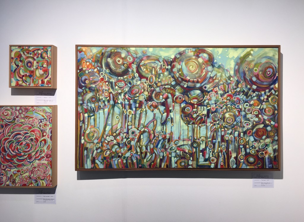
The Grove
Matthew J. Frock
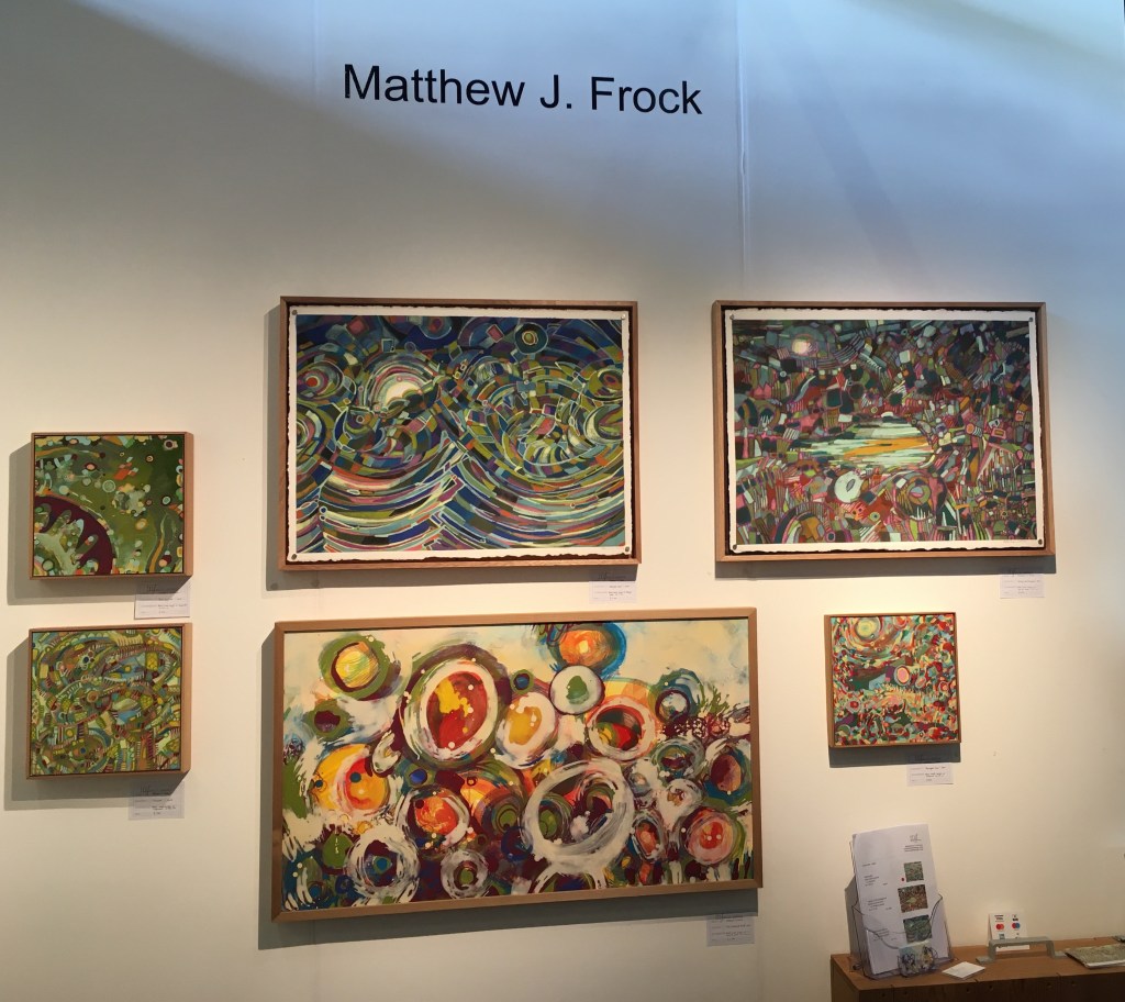
Matthew J. Frock
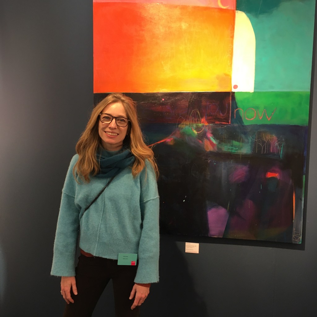
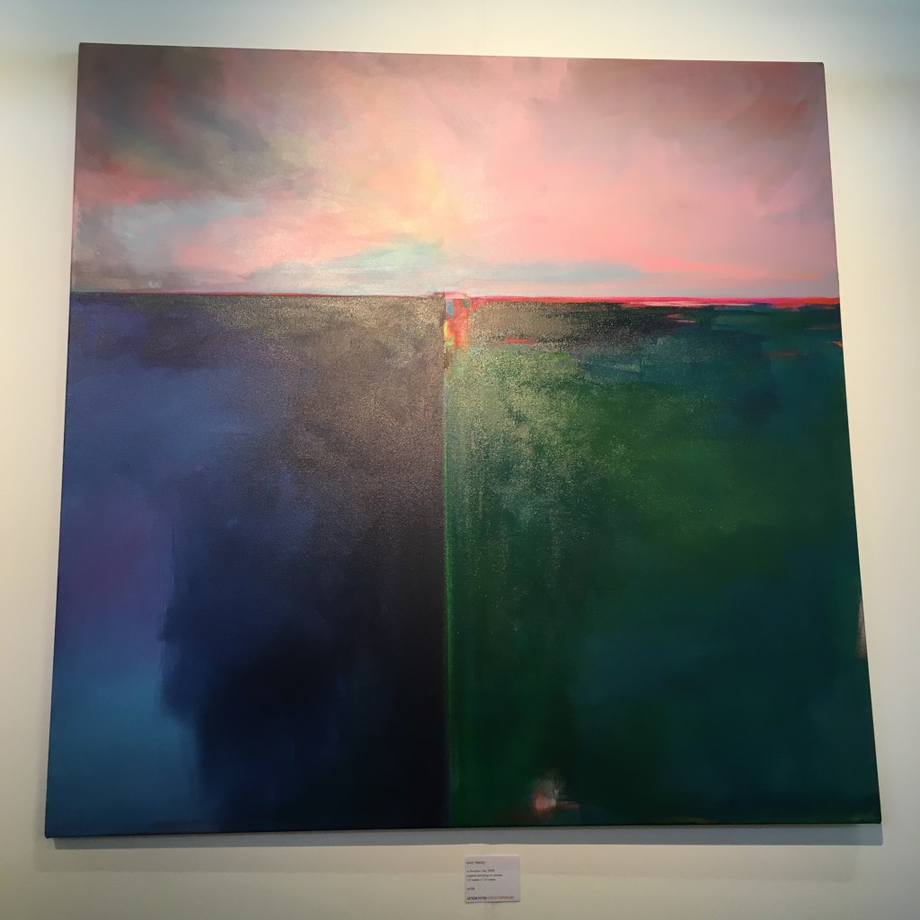
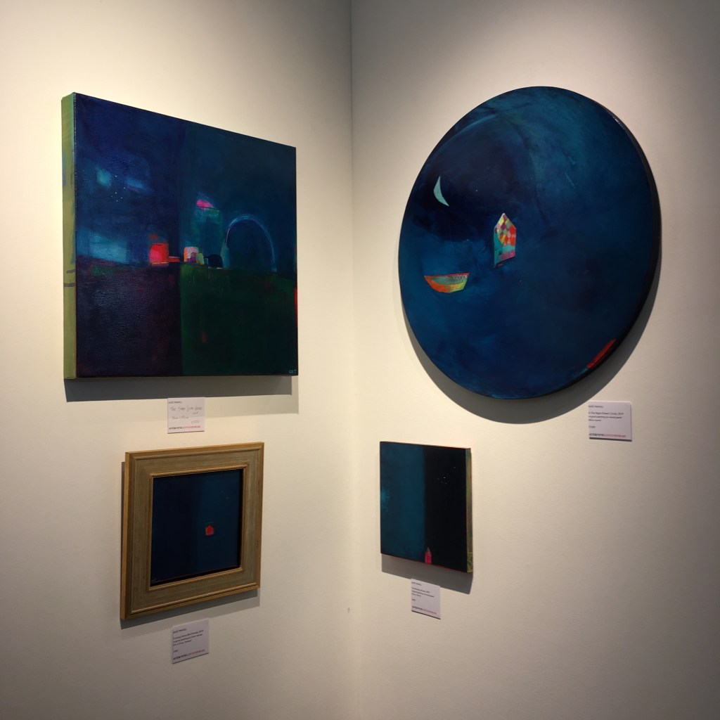
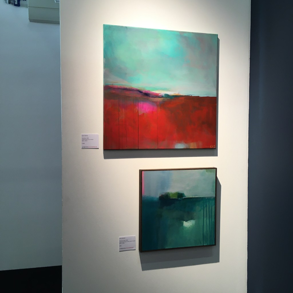
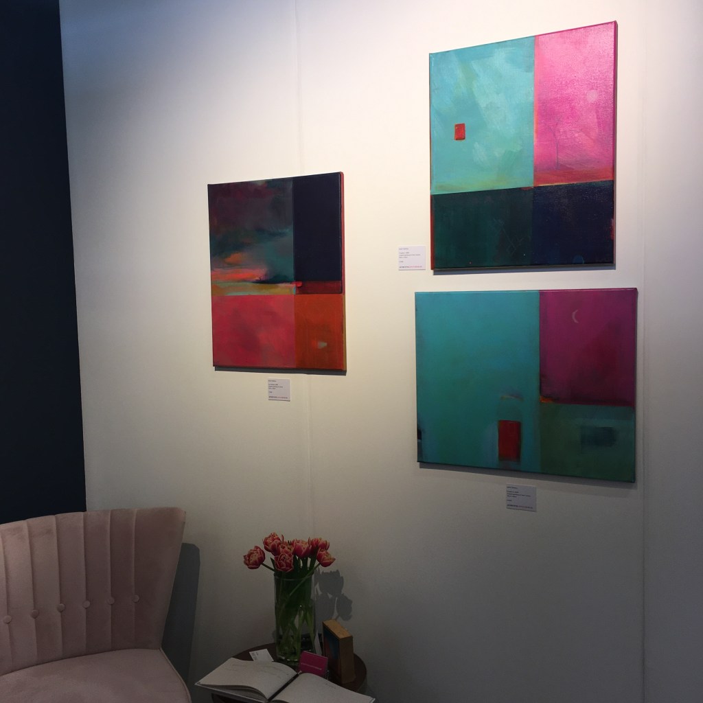
My mobile phone photographs do not do justice to the work of Kate Trafeli. Her luminous, velvety deep colour palette shines with contrasts, clear definition in sections and clever juxtaposing of the colour wheel. She is experimenting with colour and enjoying the effects created by her choices especially in her Serie di Finestre her solo showcase with After Nyne Gallery. Trafeli’s canvas is dissected by panels of colour as if looking through windows which interpreted figuratively or existentially transport the viewer to another place, particularly with In Another Life which combines the four elements and encourages the interpretation of deep water, ethereal air, green earth and flashes of fire on the horizon.
Kate Trafeli 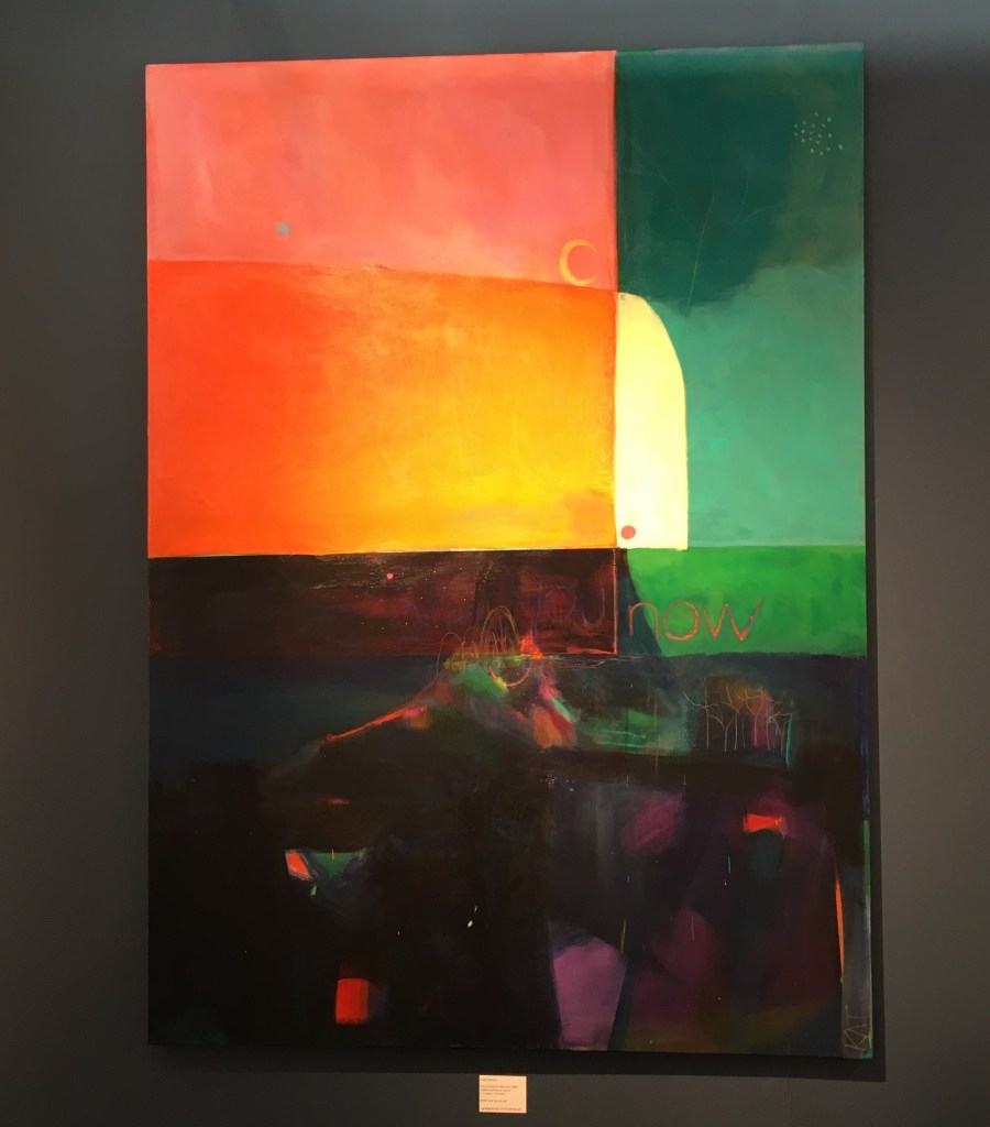
The Country Of Inbetween
Kate Trafeli
In Another Life
Kate Trafeli
Swirl by Alison Johnson, at Signet Contemporary Art, displays an impending storm, or the realisation of a break in the clouds. This was a piece that made an impression and who knew the artist would be local to me in Warwickshire? I travel all the way to London to find what is on my doorstep.
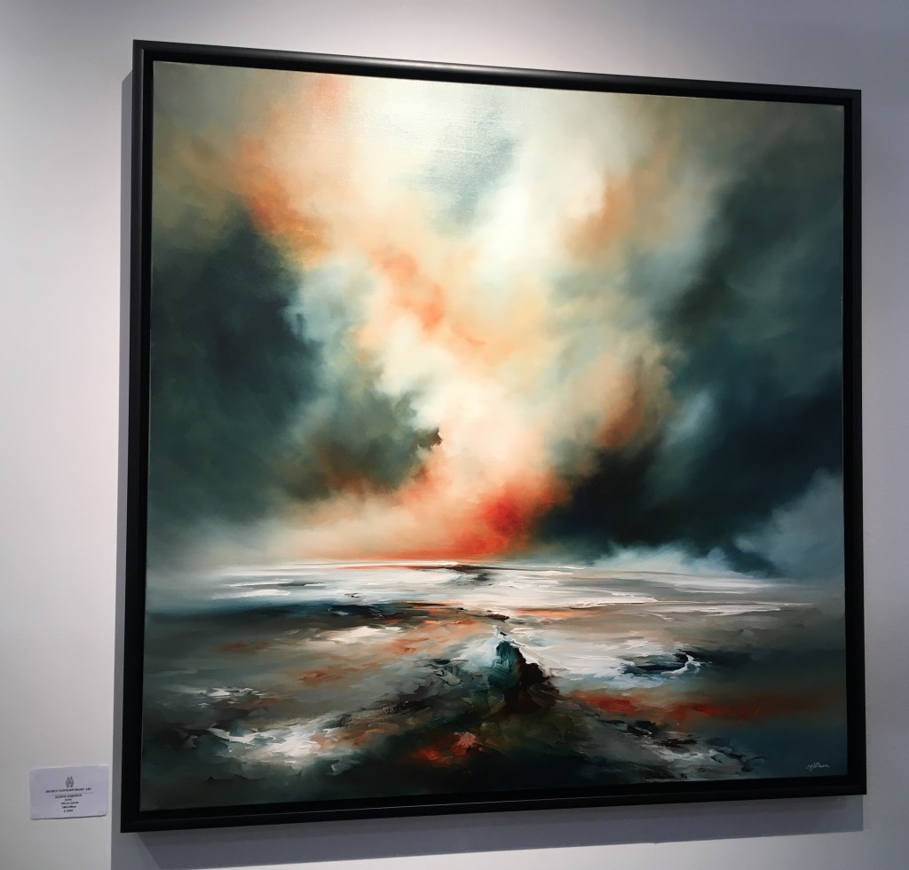
Swirl Oil on Canvas
Alison Johnson
